Guide
Aesthetic calorie tracking is not vanity — it is adherence
If an app feels clinical, you open it less, and an app you do not open produces no data. Here is how to judge tracker design on the thing that matters — whether you still open it in week six — with a test you can run before installing anything.
Updated 2026-08-16By Chris RichardsAll guides
The spreadsheet problem
Legacy calorie counters optimised for database size and information density. In 2012 that was the right call: the differentiator was whether the app knew what a Pret chicken salad was. Everyone knows now, so density stopped being a feature and started being a cost.
The result is an app that opens onto fourteen numbers with equal visual weight, three tabs of secondary metrics, and a promo card. Reading it takes effort, and effort at the moment of logging is exactly where the habit breaks. This matters practically, not just aesthetically: the self-monitoring literature ties outcomes to how consistently people record, so anything that reduces the number of days you open the app is a nutrition problem wearing a design costume.
What "aesthetic" should actually mean
Not pastel emptiness, and not an app so minimal it hides the numbers you came for. Aesthetic in a tracker means the screen answers your question before you have finished reading it. Here is the concrete version — five things a good daily view gets right.
- One number is obviously the headline. You should know how the day is going in about a second, without comparing figures.
- Numerals are monospaced and aligned. Proportional digits make columns of numbers jitter, and jitter costs you a re-read every time.
- Contrast is spent on data, not chrome. If the brightest thing on screen is a button, the design is arguing with itself.
- Nothing on the main screen is trying to sell you something.
- The week is visible somewhere. A habit tool that only ever shows today is measuring the wrong unit.
A five-minute test before you install anything
Run this on any tracker's App Store screenshots before downloading. Open the first one and give yourself two seconds: can you say what the daily total is? Then count the separate numbers on that screen, and the taps the screenshots imply between opening the app and saving a meal. Check whether any screenshot shows an ad slot or an upgrade banner — that is the daily view at its most flattering, so the real thing is not better. Finally, the one people skip: can the app show you a week? If every screenshot is a single day, it will make you feel each individual day, which is the fastest route to reacting to noise.
A worked example: one number instead of fourteen
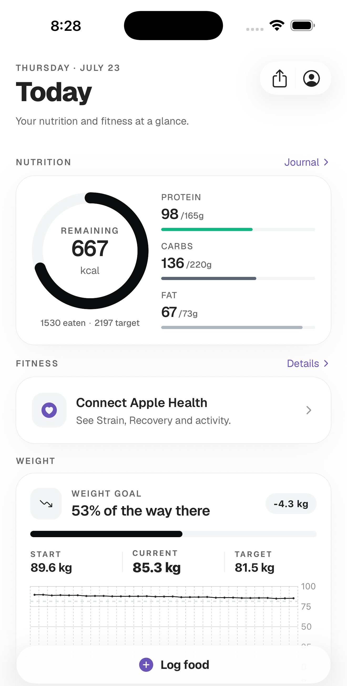
Take a real day. You have eaten 1,530 kcal against a 2,197 target, with protein at 98 g of 165, carbs at 136 g of 220, and fat at 67 g of 73.
The dense presentation gives you all eight of those figures at equal weight, plus the percentages, plus fibre and sugar. Fourteen numbers, no hierarchy — you do the subtraction yourself to answer the only question you opened the app to ask.
The designed presentation leads with 667 kcal remaining as a ring and puts the macros underneath as bars with grams still to go — 67 g protein, 84 g carbs, 6 g fat. Same data, arithmetic already done, one glance. That is what the Corvex daily card does, and the reason is not prettiness: you will open this screen four times a day for a year, and a second of friction each time is a tax you pay 1,400 times.
Shareability as reinforcement
Design also determines what progress looks like when it leaves the app. If your only shareable artefact is a screenshot of a dense dashboard, the social version of tracking defaults to photos of bodies and before-and-afters. A tracker that exports a clean sticker for a streak or a macro day gives you a different thing to be proud of — the behaviour rather than the body. Corvex exports stickers sized for Instagram Stories, Snapchat and TikTok for exactly that reason; the sharing guide covers when not to use them.
The failure mode: beautiful and slow
There is a real trap on this side too. Some minimal trackers achieve calm by hiding function — logging a meal takes six taps and two animated transitions, search is buried, and there is no barcode scanner because a scanner is ugly. Those apps get deleted at week three just as reliably as the cluttered ones, and their users usually blame themselves rather than the app.
The test: time yourself logging a normal breakfast. If it takes more than about thirty seconds on a meal you eat regularly, the design has failed regardless of how it looks. And if you are in that trap now, do not switch on the strength of screenshots — install the candidate, log one real week alongside your current tool, and keep the one you actually opened on the bad days.
What this guide does not cover
It does not rank specific apps — visual design changes with every release, so use the test above on whatever is in front of you. It also makes no claim that a better-looking app produces better health outcomes. The honest chain is narrower: design affects how often you open the app, and how often you record is the part the research links to outcomes. Everything else — what you eat, what your targets should be, whether tracking suits you at all — sits outside a design discussion entirely.
FAQ
Does a nicer app really change results?
Not directly. What design plausibly changes is how many days you log, and consistency of self-monitoring is the part with evidence behind it. Treat design as a lever on adherence, not as a nutrition intervention.
Minimalist or comprehensive — which should I pick?
Pick the least the app can show while still answering your question in one glance. If you genuinely need micronutrient depth, take the density; most people tracking calories and protein do not, and pay for the density every day.
Are dark, "clinical" interfaces bad?
No. Clinical is a hierarchy problem, not a colour problem. An app can be dark, dense, and still lead clearly with one number. The failure is when everything is emphasised, which is the same as nothing being emphasised.
Sources
- [1] Burke LE, Wang J, Sevick MA. “Self-monitoring in weight loss: a systematic review of the literature” (2011) — Journal of the American Dietetic Association 111:92–102 (PMID 21185970)
General nutrition information, not medical advice. Calorie and macro targets are estimates — talk to a doctor or a registered dietitian before changing your diet, especially if you are pregnant, managing a health condition, or have a history of disordered eating.
Get the app
Open Corvex on your iPhone
Track calories, weight, and macros in a daily log you will actually keep — then share progress stickers in one tap.